How to Design Text Cookie Cutters
Make name, phrase, and event cookie cutters that stay readable after printing, cutting, and baking.
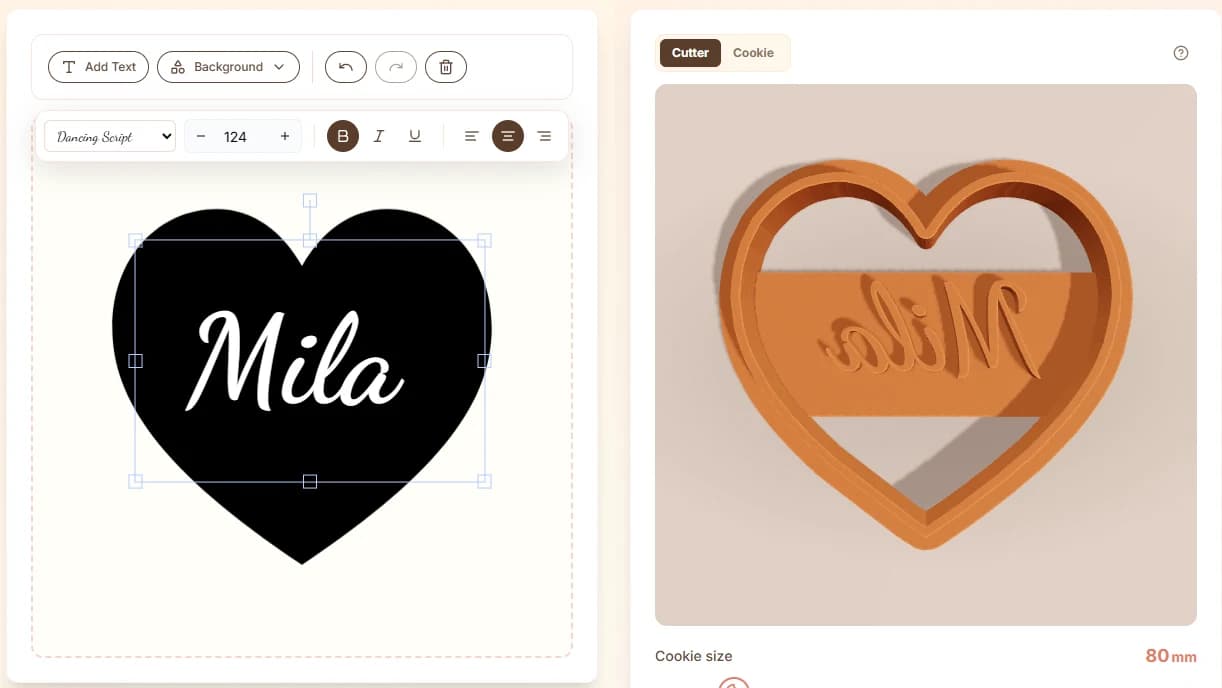
Readable text starts with short copy
Text cutters work best with names, initials, short words, and compact phrases. The longer the phrase, the smaller each letter becomes, and the more likely it is that counters, joins, and thin strokes fail in print or dough.
If you need a long message, consider making a simple outline cutter and adding the message with icing, embossing, or a separate stamp.
Choose fonts for CutterForge, not just style
A font can look beautiful on screen and still be a poor cutter font. Thin scripts, disconnected letters, tiny serifs, and decorative swashes often become too delicate at cookie size. Bold sans-serif, rounded display, and chunky script styles are usually more reliable.
The CutterForge design tool gives you a visual editor so you can test text at actual cookie size rather than guessing from a static mockup.
- Use bold or medium-weight fonts.
- Avoid hairline scripts and tiny serifs.
- Increase spacing where letters nearly touch.
- Check inner counters in letters like A, O, B, P, and R.
Support islands and disconnected strokes
Letters with holes and disconnected parts need enough surrounding structure to remain printable. If a word contains dots, accents, or separate decorative marks, decide whether those details are essential.
For small cookies, simplify aggressively. The best text cutter is the one that remains readable after baking, not the one that preserves every font detail.
Ready to build it in CutterForge?
Create a name or phrase cutter, preview the result, and export the STL.